Thursday, September 27, 2007

Phossy Jaw


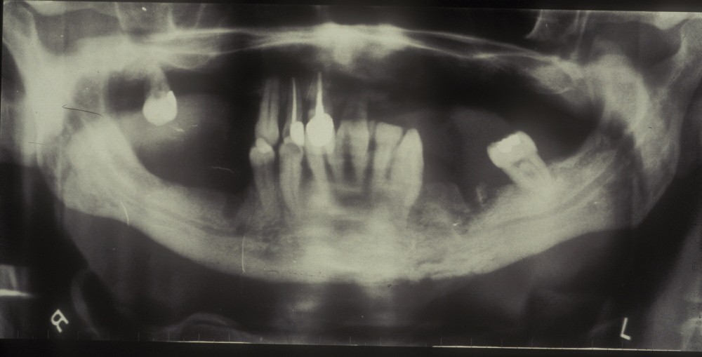
Fossy Jaw is about bringing to attention work place hazards that may not seem harmless at first but over time can cause painful disease. Breathing dust or chemicals, being forced to work in unsafe conditions, these are just some of the things people must go through in order to survive. Most the time it is the owners of the business that already know the dangers behind their businesses, and choose to sweep it under the rug in the name of profit and effeciency. This is history and history will repeat itself. That is why we must beware and stay careful and steadfast in the face of commerce.

Tuesday, September 25, 2007

On assignment 4 I tried using a use-timeline to build my dramatic arch and to map out the paths to each scene. Reading the first chapter of cause and effect gave me some insight to how to construct a timeline that is interactive. Getting started doing this seems like it could help organize a jumble of ideas that could go in any direction, but all possibilities ending in the same spot. It wouldn't have to end in the same spot, but having a central theme and to be seen as a whole. The preparing was a good idea but I don't think I was prepared enough. The codes I tried to use ended up confusing me more than anything. More time code writting will do me some good.

Thursday, September 20, 2007

Phossy Jaw


The project of writting actions in with our flash movies is somewhat frustrating. Applying old elements in a new way helps realize the potential of images, where as before we were limited in what we could accomplish.

Tuesday, September 11, 2007


A summary of my approach to my first flash animation:

My subject matter was determined by the overall project of the aggrandizement of the matchbook. I chose a subject related to matchbooks and matches which is the disease of phossy jaw. The intent was to portray the description of the disease through typography, letting the words illustrate in their shape, size, and color, the emotion that should be carried over to the viewer. In reality what happened was that more concern was taken in getting the Flash elements to work properly and less attention was given to asthetics and more to getting all the required tweens and other such fun stuff. In the end I know what it needs, but have spent enough time on this project for now.

Monday, September 10, 2007


Pablo Ferro
Maurice Binder


The most important typography designer of our time, MATTHEW CARTER (1937-) is one of the few designers whose work is used by millions of people every day. Having devoted the first half of his career to typefaces for use in print, such as Miller and Bell Centennial, he then pioneered the design of fonts for use on screen, notably Verdana for Microsoft.

Milton Glaser


The simple shapes and flat colors are inspiring for flash users for their ease of use within the program.


Milton Glaser represents thought in modern design. It doesn't just look cool it has meaning behind its function. His designs work on the basic principles of design. The straight forward look, with out extra forms or unneeded elements, makes his designs visually readable and understanadable in an instance.


Milton Glaser 
in brief
Milton Glaser (b.1929) is among the most celebrated graphic designer in the United States. He has had the distinction of one-man-shows at the Museum of Modern Art and the Georges Pompidou Center. In 2004 he was selected for the lifetime achievement award of the Cooper Hewitt National Design Museum. As a Fulbright scholar, Glaser studied with the painter, Giorgio Morandi in Bologna, and is an articulate spokesman for the ethical practice of design. He opened Milton Glaser, Inc. in 1974, and continues to produce an astounding amount of work in many fields of design to this day.

From the Milton Glaser site

Monday, September 3, 2007

xx
x
x
x
x
x
x
x
x
x
x
x
x
x
Match Rockets

Hmmm.... doesn't that look like fun.